5 Outreach Metrics That Actually Drive Revenue
Open rates are noise. Track the metrics that matter replies, positive replies, meetings, CAC per meeting, and segment performance across. Outreach Magic
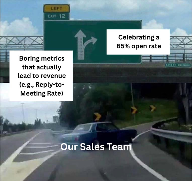
We’ve all been conditioned to celebrate the flashy, top-of-funnel metrics: open rates, click-through rates, and new LinkedIn connections. They look great on a dashboard and give us a comforting sense of activity.
But they are often a mirage. They are vanity metrics that tell you very little about whether your outreach is actually generating pipeline. While high open rates are a good starting point, true optimization comes from tracking the "boring," less obvious metrics that bridge the gap between activity and results.

These are the diagnostic tools that tell you not just what happened, but why. Here are five of those boring-but-brilliant metrics you should start tracking today.
1. Reply-to-Meeting Conversion Rate
- What it is: The percentage of unique, positive replies that successfully convert into a booked meeting.
- Why it's important: This is the ultimate measure of your reps' effectiveness at the funnel's most critical stage. A high reply rate but a low reply-to-meeting rate is a massive red flag. It tells you your messaging starts conversations, but your team is fumbling the handoff. Tracking this helps you identify who needs coaching on conversation skills, not just email-writing. It's one of the most crucial positive outreach analytics you can track.
2. Lead Velocity Rate (by Channel)
- What it is: The time it takes for a lead to move from the first touchpoint to a key conversion event (like a booked meeting), segmented by channel.
- Why it's important: This metric tells you which outreach strategies are working fastest. Is your LinkedIn campaign generating meetings in 7 days, while your email sequence takes 21? Knowing this allows you to allocate resources intelligently. It moves the conversation from "which channel works?" to "which channel works for our current business need?"
3. Touchpoint Density
- What it is: The average number of touchpoints (emails, LinkedIn messages, calls) a prospect receives before they book a meeting.
- Why it's important: This number is your secret weapon against giving up too early. Most reps stop after 2-3 attempts, but your data might show that your best deals only come after the 7th or 8th touchpoint. Tracking this proves the value of persistence and a multi-channel approach, forcing you to unify your email and LinkedIn outreach reporting to see the full picture.
4. Disqualification Rate (by Segment)
- What it is: The percentage of leads marked as "Not a Fit" after outreach has started, broken down by segment.
- Why it's important: This is the ultimate feedback loop for your targeting. If your "VP of Marketing in SaaS" segment has a 50% disqualification rate, you have a massive list quality problem. It means you haven't found your golden ICP (Ideal Customer Profile) and are wasting your reps' time. A low DQ rate is a sign of excellent prospect-market fit.
5. Revenue per Channel (True Attribution)
- What it is: The total closed-won revenue that can be attributed back to the outreach channels that sourced or influenced the deal.
- Why it's important: This is the final boss of outreach metrics. It moves beyond meetings and connects your efforts directly to the only number the CFO cares about. Tracking this requires a multi-touch attribution view to see how email and LinkedIn worked together. This is the metric that justifies your budget and proves your team's value.
From Boring Metrics to a Unified Strategy
The reason most teams don't track these metrics is simple: it's hard.
Trying to calculate "Touchpoint Density" or "Lead Velocity Rate" by manually stitching together CSV exports from multiple platforms is a soul-crushing, error-prone task. It’s impossible to do consistently at scale.
This is the entire reason we built OutreachMagic.io.
Struggling to track the metrics that actually drive revenue? Outreach Magic makes it easy by unifying your email and LinkedIn data into a single dashboard. Stop stitching together CSVs and start seeing your true performance, from Touchpoint Density to Revenue per Channel. Try it free today.
---
Ready to trust your numbers across every channel? Outreach Magic is the unified analytics layer for email + LinkedIn, so you can finally see what’s working end to end.